What Mark Cuban’s new drug company can teach you about ecommerce website copywriting
While Mark Cuban’s recently launched drug company shows UX growing pains, the copy big idea understands the major pain of American consumers — all built on a desirable product.
Watch the full website copywriting analysis in the video below.
- Fresh start, familiar problems
- Solid hero with opportunities to improve
- The first meaty section: Why here?
- Addressing a HUGE pain point
- Leaning heavily on ‘Get Started’ CTA
- The curious case of the surprise page
- Using copy to reduce expenses with an explanation
- A strong method to make it personal and build trust
- Despite starting hiccups, the foundation is strong
- About Michael Antonicelli
Fresh start, familiar problems
It’s not every day a billionaire launches a brand spanking new company in a new vertical with their name as a brand selling point.
But that’s familiar territory for Mark Cuban.
While my retired parents give Mark Cuban Cost Plus Drug Company a thumbs down for usability (more on that at the bottom), I give it a mostly thumbs up.
The copywriting choices show Mark and company understand the need to:
- Address the major pain point of transparency
- Educate both patients and providers
- Set up expectations for fear of unknown
- At times, play the emotion card.
- Picks a fight against the big drug companies
What follows are highlights from my full website copywriting analysis.
Solid hero with opportunities to improve
The main elements in the hero section are:
- Headline
- Product slider
- CTA button
And the trust bar below the fold.
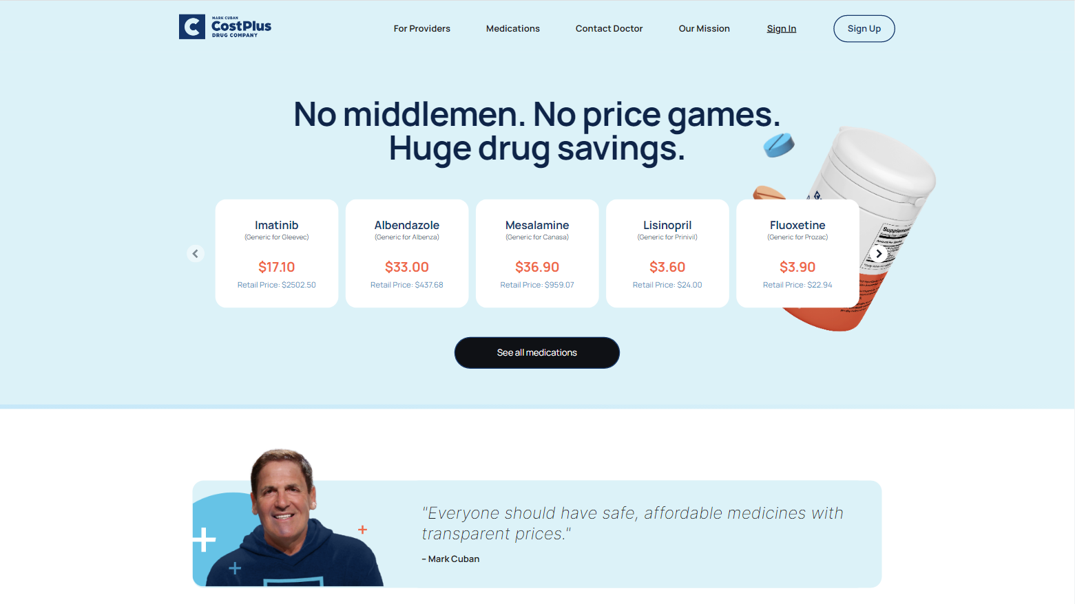
The Headline
The headline gets the point across in a tagline style.
Not a life-changing headline. But, hey, headlines are hard.
If we were to stick with this headline style, I would try to improve on this by playing with the antonym a little bit more.
So ‘huge’ would mean the other antonyms would be small or little.
Or instead, play the antonym off the first part:
No middlemen. No price games. Just huge drug savings.
Not this. Not this. Just that.
Another option: I’d make a play for a value proposition headline.
Mark could easily say something along the lines of Cost Plus being the only place where you see exactly where your medication money goes.
Interestingly, there’s no subheading.
I’m a big proponent of having a subheading in your hero section. You have prime real estate to expand your claim from the headline or entice added desirable benefits.
A big win here with the product slider; chiefly because that puts low price comparison front and center.
Speaking of front and center, it’s no accident they start with Mesalamine right in the middle; A $36 drug that retails for nearly $1,000.
Is there a better way to contrast yourself against big, faceless drug corporations than to put one friendly person everywhere?
Mark Cuban is his own trust bar.
Typically a trust bar under a hero section might include logos, publications, testimonials, or quotes. In this case, we have Mark Cuban’s name, picture, and a quote.
Since Mark is a known billionaire and popular figure, he lends the needed authority and trust early in the consideration process.
Is there a better way to contrast against big, faceless drug corporations than to put one familiar, friendly face everywhere?
The first meaty section: Why here?
Your second scroll takes you past the gates to this section:
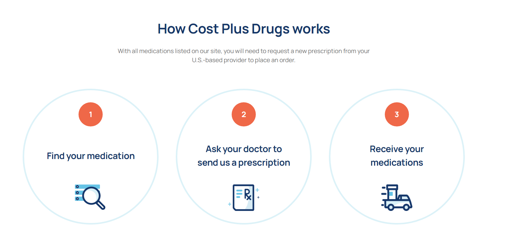
Why did they decide to start their body copy — in an important starting spot — with ‘how it works’?
It’s possible that “How does Cost Plus Drugs work?” is the top question on every curious visitor’s mind.
And there’s still plenty of Americans that never purchased drugs like this. Millennials and tech-capables may have used an online pharmacy or get the gist fast.
So the copy here sets up exactly what happens in a simple three-step process.
You might say, ‘No Duh’, for Step 3: Receiving your medications.
And maybe they could have put ‘by mail’ there. But the more you can properly temper expectations, the better.
Addressing a HUGE pain point
Without a doubt, low drug prices are the number one reason to visit Cost Plus.
But Mark gives us what Americans lack in US healthcare: Full transparency.
So early on the homepage is this fella:
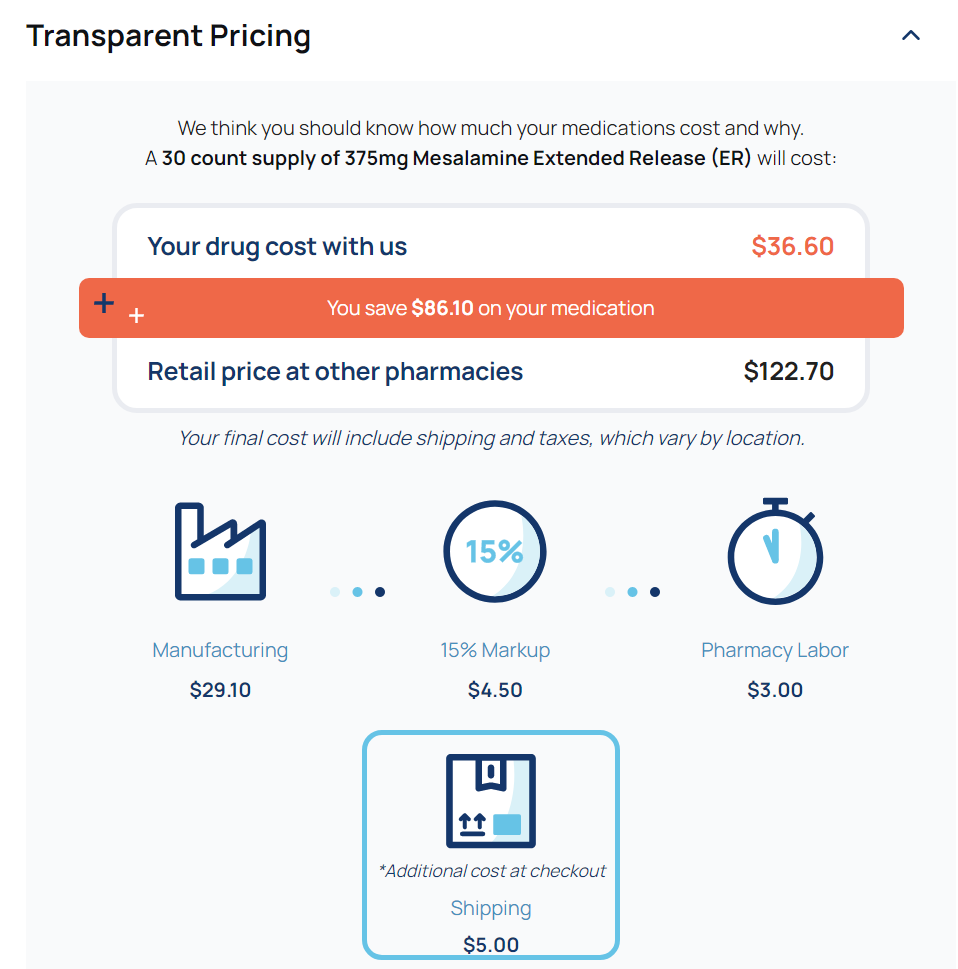
You’ll see this customized on every single drug product page throughout the site.
Which I love as a consumer and copywriter.
They’re also attempting to use the Contrast Principle by showing the typical retail price and their price.
But they didn’t do it right.
A quick primer on Robert Cialdini’s Contrast Principle:
You can minimize sticker shock by showing a much larger price before a smaller price.
Cialdini uses an example of a men’s suit shop selling more expensive accessories, such as a belt or tie, by contrasting the price to an expensive suit.
You take advantage of the Contrast Principle by putting the larger number first.
But Mark Cuban’s Cost Plus reversed the order here: Lower price first, larger price after.
Now the Contrast Principle is working against them — minimizing the price difference.
Let’s have a look at the Medications where they got the Contrast Principle right.
…Mark gives us what Americans lack in US healthcare: Full transparency.

Leaning heavily on ‘Get Started’ CTA
Navigate to the Medications page and you’ll see all the medications listed.
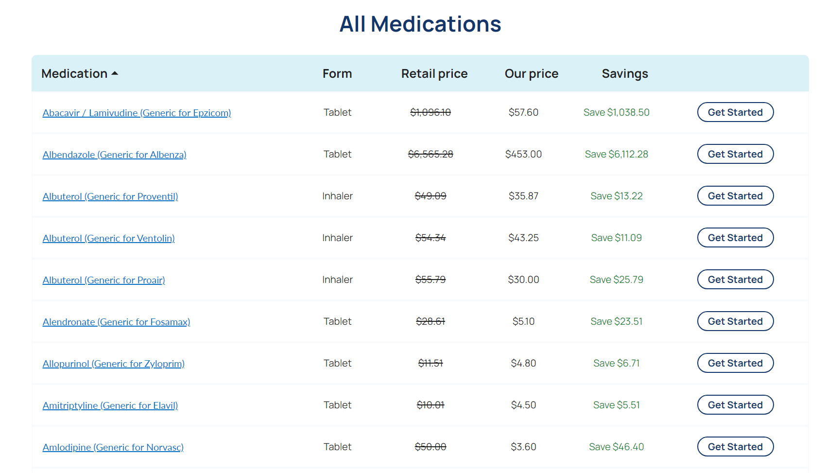
Slightly overwhelming.
The CTA for every single one of these is ‘Get Started.’
So as you scroll, you’ve got ‘Get Started’ flashing in your face hundreds of times.
Here’s hoping that once you log in, these CTA’s might change.
Or simply go directly to the Product page.
But hey, at least Mark got the Contrast Principle correct here.
The curious case of the surprise page
Click on any “Get Started” button, and you get taken to, well, a page that says ‘Let’s get started’.
(Since that’s every CTA on every page for every product, you may be sick of reading ‘get started’ by this point).

But that’s all this page has. No functional progress.
You can only press ‘Continue’. Doing so will take you to create an account.
Why surprise with this message on the way to finally getting started?
Doesn’t this add unnecessary friction?
Short answer: Yes.
Long answer: Yes, but necessary friction. Which could be done better.
The point of this page is future pacing (letting the visitor know what’s coming) and offering a ton of support.
Two strategic reasons behind Cost Plus’ decision;
A) Remember, buying drugs online is still a new concept for some Americans. So here’s exactly what they can expect.
B) The process is more involved than a regular ecommerce. You’d need to set up an account AND add a health history. Then have your doctor send over a prescription first.
Though I’m not sure if this could be a regulation that they can’t add to cart until there’s a prescription. Or it could be a play for account sign-ups.
The page is stopping point. Sure. But they need people to be prepped.
Look at all the support offered here:
Literally all body copy is assurance, preparation, and sharing the effort:
- It won’t take long.
- We’ll show you how to talk to your doctor.
- We’ll let you know when it’s ready.
- Quick and cost-effective. (< This one seems like placeholder copy)
Cost Plus needs to counter expectations for an Amazon-like experience. Add to cart, see total costs, one-click ordering.
In the future, I’d like to see adding this to at least the first step in the process so there’s prep AND progress.
Using copy to reduce expenses with an explanation
Here’s an interesting bit from the contact doctor page:
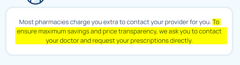
I’m not sure about pharmacies charging extra to contact your provider.
But they made it quite clear the goal of this section is to lower administration fees, inquiries, and steps in the process that add more costs.
My guess is you always need to contact your doctor. Even past the initial first order, like prescription refills.
A strong method to make it personal and build trust
Have a look at the personal letter appeal on the Mission page:
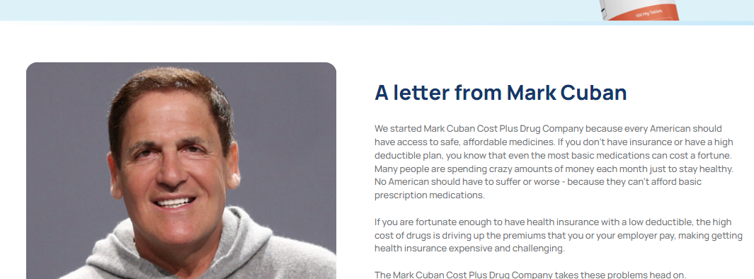
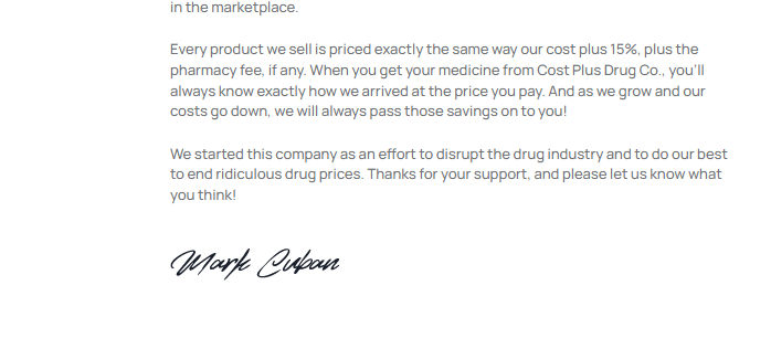
I’m a big fan of the signature and personal letter from the president. In fact, I add them to my clients’ About pages.
Few copywriting devices are more personal than a letter.
Remember, Mark is contrasting with those big, faceless drug companies that don’t seem human.
Few copywriting devices are more personal than a letter.
Despite starting hiccups, the foundation is strong
Since my video review, my retired parents gave Mark Cuban Cost Plus Drugs a shot.
The consensus?
Thumbs down.
Their cost savings compared to Medicare plus supplemental wasn’t worth the effort to switch. And they’re accustomed to Amazon-level ordering simplicity without the extra steps.
But for most Americans that need the low-cost drugs –insured and uninsured alike– I don’t think the UX friction will stop an order.
And there’s a lot of skill behind the copy to make the website a success.
That reminds me. I need to call my doctor to send my prescription over to Mark Cuban.
Psst!
Give your own website a proper copywriting
inspection to improve conversions
Reserve an in-depth Website Copywriting Analysis for your website.
About Michael Antonicelli

Michael Antonicelli is a website conversion copywriter and strategic consultant.
Through a zigzag route of a career — including being a former Disney video game animator — he’s gained a unique combo of left-brain and right-brain thinking to help companies like Podium, CXL, and N6A grow revenue.